Making Tokyo Metro Markov Models
As a follow-up to an earlier post on the real-world experiences / beginning inspiration behind this project (tldr; I was in Japan for three days and it was a lot of fun), I wanted to spend some time documenting how I went about putting together the visualization.
From the start, there was going to be some backend work and some frontend stuff. Because I wanted to build an app that could run purely client-side, i.e. hostable on Github Pages, I figured I’d do all the processing I wanted first in a notebook, then save the results as JSON files for D3 and React to load up and prettify.
The Data Grind
Spend any time searching for animated map visualizations and you’re bound to run into some pretty cool projects. There’s this pretty famous visualization on NYC taxi trips, and Foursquare themselves published a couple videos displaying Foursquare check-in data over a day in various cities (Tokyo included). The basic idea for these seemed to be organize a bunch of location data that was also time-indexed, then when it comes to viz time fetch the data, set up a time counter, and when clock strikes $x$ present everything related to index $x$ on the frontend. Although I was initially curious if I could get data from past IC card check-ins, in an act of present-self laziness complying with future-self demand to be challenged, I found the Foursquare check-in data for 2012-2013 in Tokyo pretty quickly on Kaggle and decided to settle for that.
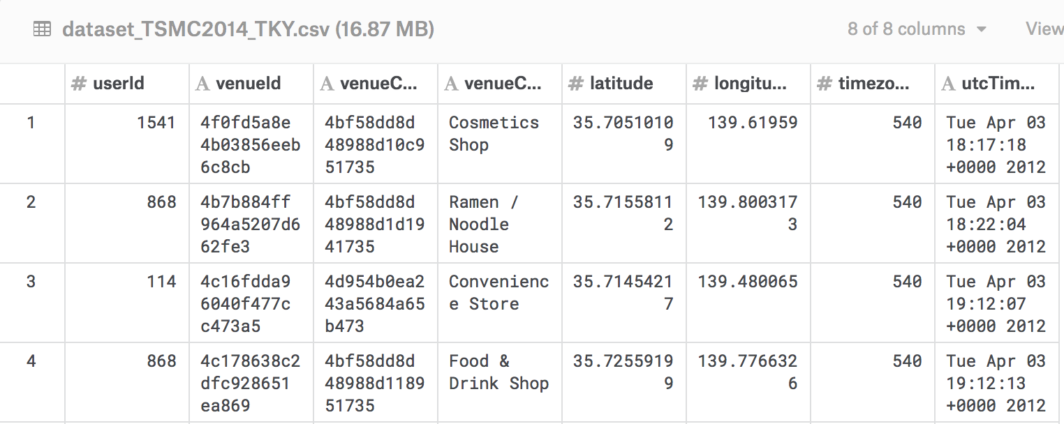
The Foursquare data itself displayed features for the venue, latitude and longitude, and time of the check-in. Since I wanted to capture subway system travel, the main idea would be to filter the check-ins for those that matched the Subway category, figure out where the Subway stations in Tokyo actually were, and cross-reference those to the check-ins to determine when people were visiting specific stops. I probably could have used the Foursquare API to check the venue based on id, but ¯\_(ツ)_/¯. Also there was this nice raw JSON file with data on all of Japan’s train associated with an npm package called japan-train-data, so more filtering for the subways, but still ¯\_(ツ)_/¯ .
When it came to actually linking the data sources, I first wanted to reduce potential coordinate noise. Basically, my understanding was that Foursquare users check in on mobile devices based on geolocation data, but as subway stations might be pretty big and the lat/lng coordinates did go up to 8 decimal places, for my visualization’s purposes $n$ different passengers might be checking in at the same stop across $n$ different Foursquare locations. Maybe they process this stuff–I’ve never used Foursquare–but hey it was easy enough to map check-ins to a reasonable number of locations.
I was interested in the Tokyo’s Subway, which actually spans two systems, the Tokyo Metro and the Toei Subway. Together they operate about 280 stations across 13 lines, and with the code below I wanted to find a reasonable number of decimals to keep among check-in data points to get something close to 280.
|
|
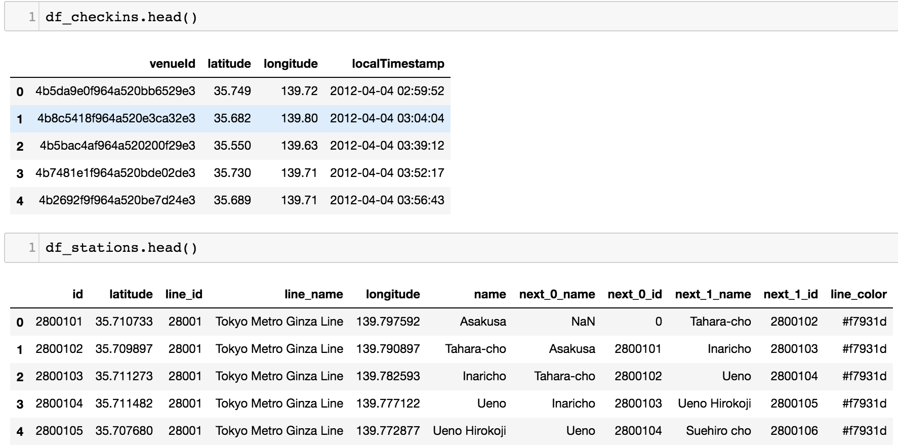
On the train data side, it was a matter of finding the relevant properties in the JSON file, and converting these to Pandas dataframes. Because it’s always nice to vectorize we first convert to a Dataframe object, filter for subways, and only keep relevant columns. Due to the actually linear nature of subway lines (each stop has at most two neighbors), for each stop we throw in it’s neighbors as features as well. Finally, with some planning for the data’s prettier future, we include the color hex code for that line.
At this point we have two dataframes–one for the Foursquare check-ins, and one for the stations–and they just need to be merged on location. After rounding, this
became this
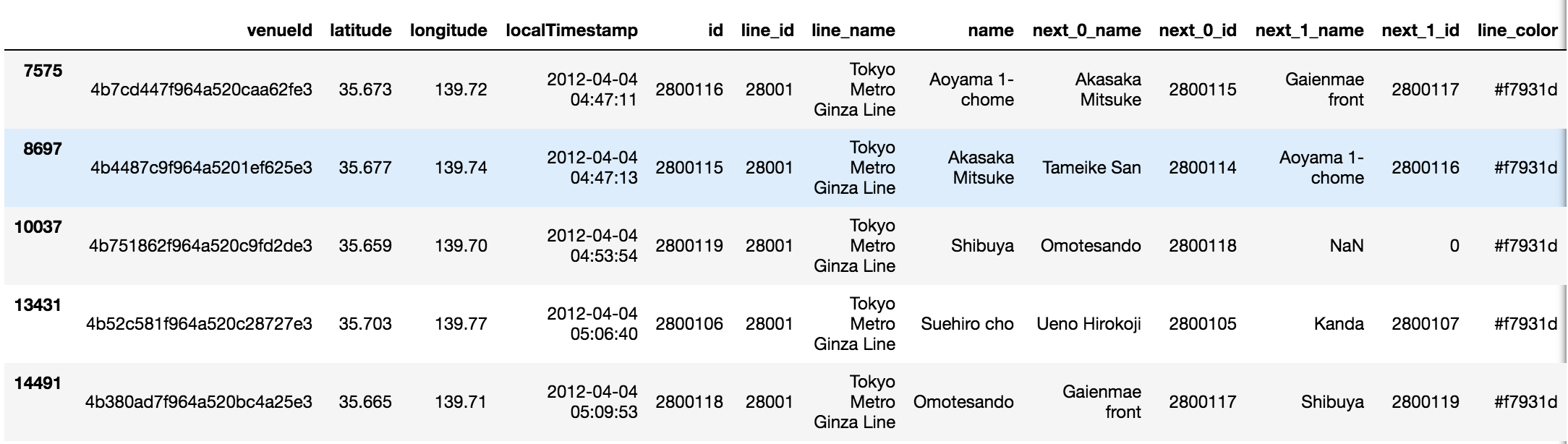
with this
1df_merge_inner = pd.merge(df_checkins, df_stations_rounded, how='inner', left_on=['latitude', 'longitude'], right_on=['latitude', 'longitude'])Transitioning with Transition Matrices
By now, my objective was pretty clear with regard to how I wanted to present the data. While I had timestamps for check-ins, replaying this would have just showed dots popping in and out of a map, which is cool but personally to me not that cool. Instead, I wanted to figure out how to add some sort of motion element. So given just the time-based location data, infer which station comes next for that check-in. This wasn’t exactly obvious to me, and also reminded me that vector-inferring GPS would be so much better1.
At the same time, while there was definitely going to be some info aggregation (mapping a whole year’s worth of data to a single day), it seemed fairly reasonable that different transit patterns occurred at different parts of the day, and I wanted to capture this as well. I was also curious if travel patterns changed much according to the month and plotted for this, and in hindsight should have also tested for differences in the day of the week.
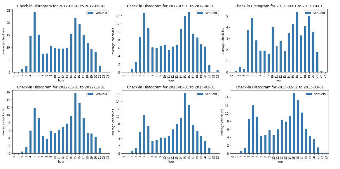
Overall, it seemed okay to just find the average usage per hour, aggregated over every day in the year.
Regarding the movement problem again, one idea that seemed kind of cool involved thinking of each stop along a line as a state in a Markov chain. Accordingly, a transition matrix could define the probability given a current station / state of moving to the next station / state. Since each station has at most two neighbors, we’d have a rather sparse matrix, expecting most values to be zero.
For implementation, I decided to be subway line-specific, constructing a set of transition matrices
$$\bf Q_L = {Q_{L_0}, Q_{L_1}, \ldots, Q_{L_{23}}}$$
where each set represented a single line $L$ and each element pertained to the transit distribution according to a specific hour in the day (only military time here). In terms of calculating these actual transition matrices, a first thought was that we could assume that the actual empirical ratios of check-ins at each station compared to all check-ins amounted to the stationary distribution for a specific hour and line, so we’d just need to think of a way to derive the transition matrix from its stationary distribution. While this sounded cool and analytic at first, I realized that this would most likely be underspecified, and even if I could come up with some constraints, googling things and trying to be clever like “how to solve for $A$ given a known eigenvector and eigenvalue $=1$” was unfruitful to the point that I thought maybe it was a dumb question (rip forgetting linear algebra).
At the end of the day I settled for a simple ratio-based test, which might not even be legal, but has some merit along the lines of an MLE approach to estimating transition probabilities directly. Given a subway line but independent of a check-in station, compute the sample probability of the neighboring station in one direction and the neighboring station in the other direction, based on all occurrences of check-ins at those stations. We’re not finding the estimates of moving to that station starting from another station directly, because we don’t have those numbers, but rather assume that how often someone checks in at a station $s_1$ at any time after a check-in at a neighboring station $s_2$, reasonably approximates the chances of someone coming from a neighboring station $s_2$ choosing to go there, at least compared to the same calculation for an alternative when passengers at $s_2$ can either go to stations $s_1$ or $s_3$.
In slightly more formal notation, the dots in the app move based on transition matrices
$
\begin{pmatrix}
p_{11}\bf I_{11} & p_{12}\bf I_{12} & \ldots
\vdots & \ddots &
p_{K1}\bf I_{K1} & & p_{KK}\bf I_{12}
\end{pmatrix}
$
for line $L$ and hour $h$, with $L$ having $K$ station stops, $p_{mn}$ being the transition probability from station $m$ to $n$, and $\bf I_{mn}$ being the indicator for if $m$ and $n$ are neighbors.
And that’s it. These empirical probabilities were saved as JSON node and link values according to popular D3 paradigms. From here the majority of the actual front-end design was figured out through other examples, and there are probably many other tutorials out there that can explain things better on that end :).
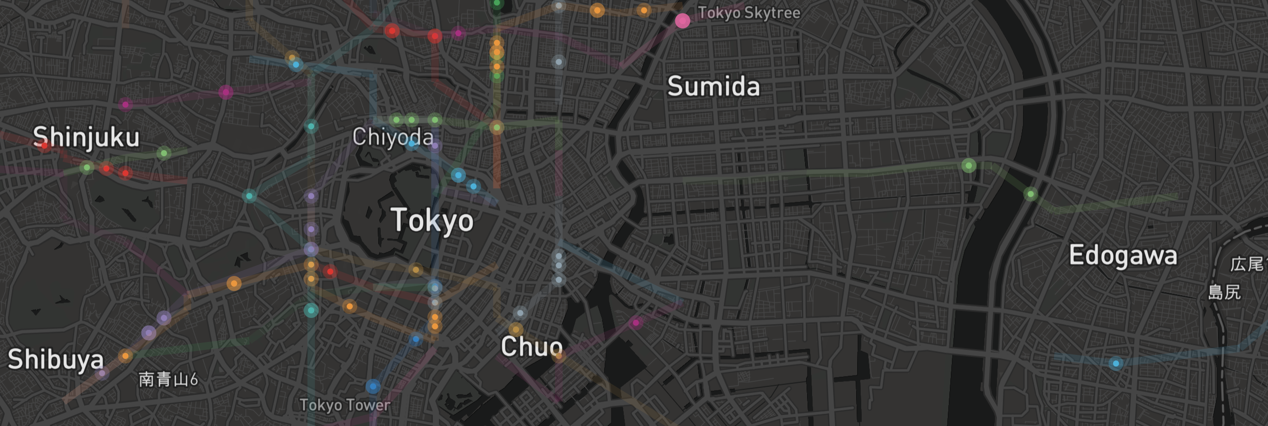
Check out the visualization here, and code available here.
- GPS gives you the direction of the path from a satellite view, but from your perspective unless there are obvious landmarks you usually need to walk a bit and then note where you’ve moved from the birds-eye view to see if you’ve gone in the right direction. It’d be great if one could just immediately tell if they needed to turn around.