Making a GitHub Contributions Graph for Life
Something I’ve recently realized is that my work habits tend to obey inertia frustratingly well. What I mean is that if I’m currently getting a lot done, or coming off a track record of getting things done, I tend to stay focused and continue to get work done. Which is nice. But this also means that if I’m being a YouTube-watching potato, I tend to stay a potato.
While I’ve never been super big into the whole life-hacking thing, I have noticed there are certain cues that help me reinforce the former mode. The motivating example of interest I want to focus on today is none other than the GitHub contributions graph.
At the end of the day I’m pretty sure this is pretty simple psychology. But keeping streaks alive is a powerful motivator, and on more than one occasion a gray square has definitely motivated me to push something, setting off a happy period of progress.
Something I’ve also tried to do in terms of habits is document everything I do, which helps me respect the progress I’m making and the passage of time. It’s also a nice way to create personal references for later. The problem is that I usually save these in some random markdown files or Google Keep, and while I’ve started and stopped some form of this since freshman year of college, there’s always the eventual die-down.
Noticing this, I wanted to build a thing sort of like a GitHub contributions graph for life. Having this could provide a nice personal visual motivator. Making it reliant on writing out the things I’ve done helps me preserve the documentation habit above. Putting it on my website provides another incentive in terms of public accountability (although I’m pretty sure no one really sees this). Finally calling it a life contributions graph makes it unnessecarily dramatic.
In fact I’ve wanted to build this since early June, and I think if you go through the commit history you can verify this. But one weekend I got distracted with something else, and then something something not working on this now $\Rightarrow$ not working on this later. It wasn’t until Hack Lodge and literally coming home to a house full of people working on projects for a week that I found the incentive to start things again.
In the spirit of a hack, I tried to keep things pretty minimal. The main technical thing related to providing the data was writing a script to parse all my markdown files into readable “commits”, and then figuring out a data schema to save all of it.
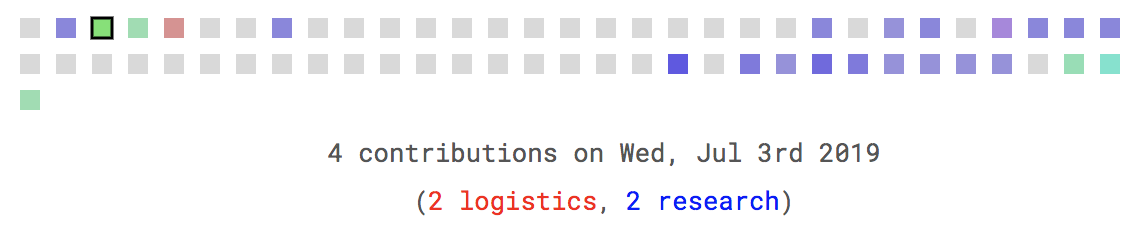
More of the thinking went into the frontend, and how to get the color scheme I wanted. If we think back to the original GitHub contributions graph, we have this situation where we start out with this light green (gray if you count zero contributions), and more contributions correlates with progressively darker shades of green. The main visual thing I wanted to accomplish however was to factor in different categories of commits, and keep this in a minimal 2D interface. For example, in any given day I might work on research, classwork, and a side-project, and I wanted to be able to create an immediate visual cue for this.
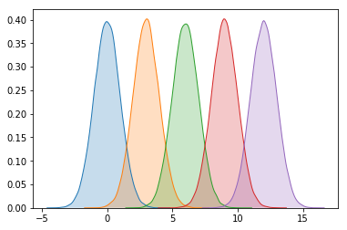
For different classes or categories of commits, intuitively we could just assign different base colors to each class, and then overlay them. If you’ve ever played around with multiple plots in the same figure using matplotlib, you can sort of imagine what this would look like.
The problem is that with multiple categories, things can sort of start to look muddled. Instead of an additive color schema that might encourage trying to get work done across various categories, we end up with this muddled regression to the brown.

Please don’t call the HCI or design police on me, but for my own purposes I wanted a brighter light square to denote maximum contributions across all categories. Think about it like achieving this pristine state. At the same time, for an individual color and category, it seemed like contributing more to that category should warrant a more intense color. Accordingly, we sort of have this interpolation problem where colors should get darker and more intense along one dimension (more contributions with respect to a single category), but inversely also get brighter along another (more contribution representation across all categories). A good analogy is light, which is additive, and where more photons leads to a more intense color, and the intersection of the most intense red, green, and blue yields white.
Color on the Internet
Now web colors work inherently in an additive manner. The most direct way to do this is to specify the intensity then for each of these channels, which is basically what RGBA does (i.e. rgba(a, b, c, d)) where a, b, c $\in$ {0, 1, 2, ... 255} and d $\in$ [0, 1].
This is fine and good for red, green, and blue, but what if we have more than three categories? In terms of mixing multiple colors and getting the desired effect, another representation that’s a lot more interpretable (at least to me) is HSL, which deals with hue, saturation, and lightness values. Turns out this is actually parameterized almost perfectly for our purposes (PPP?).

Hue denotes the base color, and spans 360 degrees across all the colors. We can easily set category colors then along uniform intervals. Saturation is a percentage from 0 to 100 denoting how intense this color is. It’s related to lightness, but we can think of saturation close to 0 being something in 50 shades of gray world (i.e. somewhere on the white to black spectrum). So as we contribute more to a category, we can just turn the saturation up.
Finally the lightness value is also a percentage from 0 to 100. To capture the Github effect, we start out with lightness = 75%, and if there are less than half of all categories represented, we actually interpolate down to 50%. On the other hand, if more than 50% of all categories have contributions, we go up to 100%. To do this in practice, we actually just map the fraction of total saturation score, or (sum of saturation over all represented categories) / (max saturation times x number of categories), to the interval from 50% to 100%.
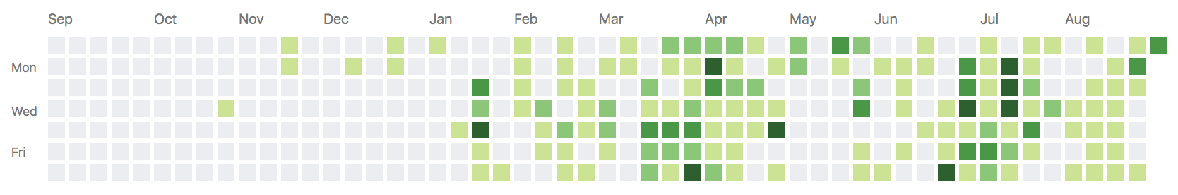
In terms of the actual implementation, most of the JavaScript is a fork off of this D3-based calendar heatmap. To change things up a bit I decided to layout the grid with rows representing months, and to display only the last 2 months. As of now, to demo it just scroll to the bottom of this page. Ideally I’d have time to do more and make it standalone (actual project page and code to come soon), but for now I probably should build up momentum on other projects.